How to read forex charts
Learning how to read forex charts is one of the first steps you’ll need to take if you’re looking to get into trading. Here we explain how you can read the four main types of FX charts to help you get started.

What is a forex chart?
A forex chart is a graphical representation showing how the price of a currency pair changes over time.
The price is plotted on the vertical y-axis, while the horizontal x-axis shows time. On IG’s trading platforms, you can choose how frequently new data is plotted to a chart by selecting a timeframe, ranging from tick-by-tick to a whole month.

How to read different types of forex charts
Forex traders tend to choose between four main types of chart – candlestick, HLOC, line and mountain – each of which is read in a different way. The type of chart you choose to use will come down to personal preference, though candlestick and HLOC charts are the most popular as they display much more information than line and mountain charts. Here we take a look at each type of chart in detail:
Candlestick chart
Candlestick charts display pricing information in long, thin bars that resemble candles.

Each candlestick shows price movement over the period of time you selected. For example, if you have chosen a 15-minute timeframe, each candlestick on the chart will show how prices developed over a 15-minute period; the only exception being the candlestick on the far right of the chart, which will show live prices for the current – incomplete – period.
At a glance, a green candlestick indicates that the pair moved up in price over the given period, closing at a higher price than it opened. A red candlestick, on the other hand, indicates that the pair’s price decreased, closing at a lower price than it opened.
In addition, each candlestick will show four specific prices for the currency pair:
- Open: the price at the start of the period
- Close: the price at the end of the period
- High: the highest price traded during the period
- Low: the lowest price traded during the period

The relationship between the four prices shown by a candlestick can tell you a great deal about how market conditions are shaping up and who is driving the price action: buyers or sellers.

Long green candlesticks may indicate that there is a lot of buying pressure, while long red candlesticks may indicate a lot of selling pressure.

Candlesticks with long wicks but short bodies, on the other hand, indicate that there was considerable pressure in one direction, but that the price was pushed back before the end of that period.
Dojis
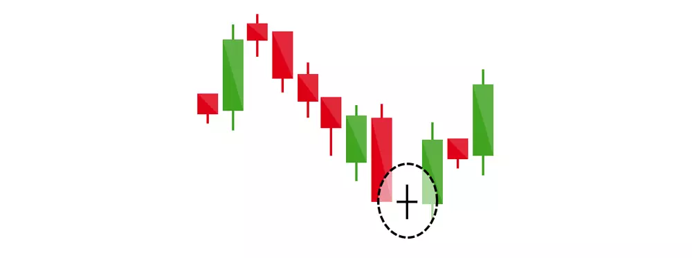
Occasionally, the opening and closing prices are equal (or very close together), creating a black cross known as a ‘doji’. This is indicative of indecision in the market, with neither buyers nor sellers able to assert sufficient influence over the direction of price movements.

Taken on its own, a doji is a neutral pattern of little significance. However, if a doji forms within an uptrend or downtrend, it may indicate that a reversal is on the way. To learn more about chart patterns, join IG Academy.
HLOC chart (also called a bar chart)
The next type of chart, HLOC, which stands for ‘high, low, open, close’, shows exactly the same data as a candlestick chart, but in a different way:
- The open price is represented by the notch to the left of the vertical line
- The close price is represented by the notch to the right of the vertical line
- The high price is the uppermost point of the vertical line
- The low price is the lowest point of the vertical line

Once again, the line will be green if the currency pair moved up in price over the given period, closing at a higher price than it opened, and red if the pair’s price decreased over the given period, closing at a lower price than it opened. It’s possible for dojis to form when the open and close prices are equal.
Line chart
Unlike a candlestick or HLOC chart, a line chart only shows the close price for the time period you have selected (eg one hour). The close prices are joined together so that the consecutive points form a line.

This is a very simple way to display pricing data as it does not give any indication of what the high, low or open price for the period was. For this reason, many forex traders only use line charts when assessing long-term trends, where some of the additional information may not be quite as relevant as it is when trading short-term patterns.
Mountain chart
The final type of chart is a mountain chart. This is the same as a line chart, except the area beneath the line is shaded, giving it the appearance of a mountain in silhouette. Like line charts, this type is mainly used to assess long-term trends, as the high, low and open prices for each period are not on show.

Using technical analysis to forecast FX prices
While this guide has introduced the basic concepts you need to know to read forex charts, many experienced traders use more advanced technical analysis to forecast price movements.
Technical analysis involves studying historical chart patterns and formations to predict the future direction of a market’s price – for example, looking at the relationship between consecutive candlesticks or HLOC bars. Find out more about technical analysis.
IGA, may distribute information/research produced by its respective foreign affiliates within the IG Group of companies pursuant to an arrangement under Regulation 32C of the Financial Advisers Regulations. Where the research is distributed in Singapore to a person who is not an Accredited Investor, Expert Investor or an Institutional Investor, IGA accepts legal responsibility for the contents of the report to such persons only to the extent required by law. Singapore recipients should contact IGA at 6390 5118 for matters arising from, or in connection with the information distributed.
The information/research herein is prepared by IG Asia Pte Ltd (IGA) and its foreign affiliated companies (collectively known as the IG Group) and is intended for general circulation only. It does not take into account the specific investment objectives, financial situation, or particular needs of any particular person. You should take into account your specific investment objectives, financial situation, and particular needs before making a commitment to trade, including seeking advice from an independent financial adviser regarding the suitability of the investment, under a separate engagement, as you deem fit.
Please see important Research Disclaimer.

Explore the markets with our free course
Discover the range of markets you can trade CFDs on - and learn how they work - with IG Academy's online course.
Turn knowledge into success
Practice makes perfect. Take what you’ve learned in this forex strategy article, and try it out risk-free in your demo account.
Ready to trade forex?
Put the lessons in this article to use in a live account. Upgrading is quick and simple.
- Trade over 80 major and niche currency pairs
- Protect your capital with risk management tools
- Analyse and deal seamlessly on smart, fast charts
Inspired to trade?
Put the knowledge you’ve gained from this article into practice. Log in to your account now.

