16 candlestick patterns every trader should know
Candlesticks are a popular type of chart used in technical analysis. Find out what they tell us, how to read them, discover some of the most popular candlestick patterns and learn how to trade them with us.


What is a candlestick chart?
A candlestick chart is one that indicates the four price dimensions: the open, the close, the high and the low. It’s one of the most popular components of technical analysis, enabling traders to interpret price information quickly from just a few sticks. It’s aptly named because it looks like a candle with two wicks.
In this article, we’ll focus on the daily chart, wherein each candlestick represents a single day’s trading. However, they can be viewed at any time frame, from one second to years.
Candlestick charts have three components to them:
- The body: represents the open and close
- The wick: also known as the shadow. Indicates the intra-day high and low
- The colour: reveals the direction in which the market is moving
Over time, candlesticks form patterns that traders can interpret to predict on future price movements and support and resistance levels. Before you trade, make sure you understand the basics of candlestick patterns and how they can inform your decisions.
What do candlestick charts tell traders?
With a quick glance, candlesticks tell traders whether a market is moving in a bullish or bearish direction – and to what degree. For example, a candlestick with a long wick at the top often signals a potential sell-off for an asset, while one with a long wick at the bottom can mean that the asset is growing bullish.
How to read candlestick charts
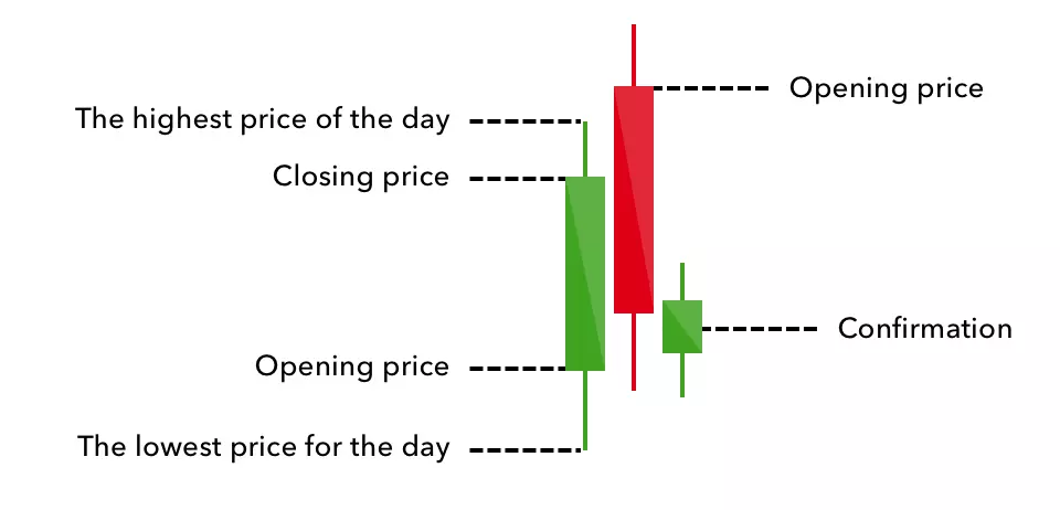
To read a candlestick chart, you need to understand its open, close and wicks.
The open and close form the body of the candle and tell us what price an asset opened at and closed at in a specific time period. Because we’re using the daily chart in this guide, we can say that these refer to the start and end of the trading day.
The opening price indicates the value of the asset as it opens for the day, while the closing price tells us what price it settled on at the end of the day.
If the price closes higher than the open price on the day, the candle will be green; if it closes lower, it’ll turn red. Remember, though, that you can adjust the colour of your candlesticks in our platform – green and red are simply the defaults.
The wicks denote the highest and lowest prices of the day – the top of the upper wick indicating the former and the bottom of the lower wick showing the latter. This part of the candlestick is much narrower than the body, so it’s easy to identify.
The range of the candlestick can be calculated by taking the lowest price of the bottom wick and subtracting it from the highest price of the top wick. Doing this enables traders to find trends and patterns.
Another important part of the candlestick to understand is its volume. The wider it is, the higher the trading volume and vice versa. Knowing this can help traders identify patterns that indicate expected market movements.
The best way to learn to read candlestick patterns is to practise entering and exiting trades from the signals they give. You can develop your skills by opening a demo account with us.
Bullish candlestick patterns
A bullish candlestick pattern is a sign for a trader to consider taking a long position on an asset. These often form after a market downtrend, signaling a price reversal.
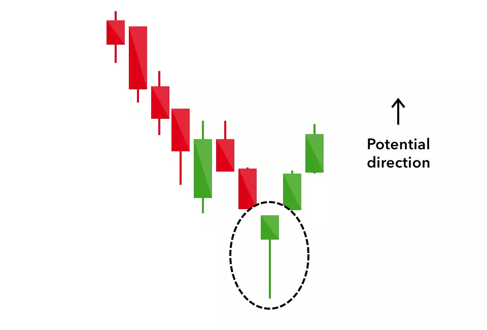
Hammer candlestick
The hammer candlestick has a short body and a long lower wick, with little-to-no upper wick, making it look like a hammer. It typically appears at the bottom of a downtrend and can indicate selling pressures during the day. Ultimately, though, it represents strong buying pressures that drive the price back up. Green hammers indicate a stronger bull market than red ones.
Inverse hammer candlestick
Similar to the hammer candlestick, the inverse hammer shows a long upper wick with little-to-no lower wick, looking like an upside-down hammer. It indicates buying pressure followed by selling forces that weren’t strong enough to drive the market price down. This candlestick pattern suggests that buyers will soon have control of the market.
Bullish engulfing candlestick
This pattern is formed with two candlesticks – the first has a short red body and the second has a large green body – essentially engulfing the first. In terms of day trading, this shows the second day opens lower than the initial one, but a bullish market drives the price up, creating a bull market.
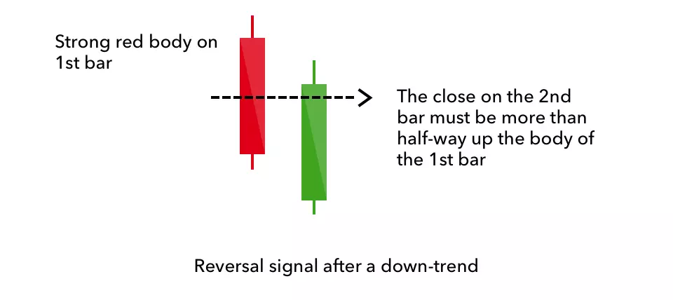
Piercing line candlestick
Another two-stick pattern, the piercing line is formed by a long red candle followed by a long green candle. There’s typically a significant gap down between the first candlestick’s opening and the second one’s closing price. It indicates a strong buying pressure, as the price is pushed up to or above the mid-price of the previous day.
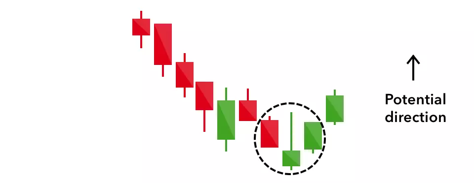
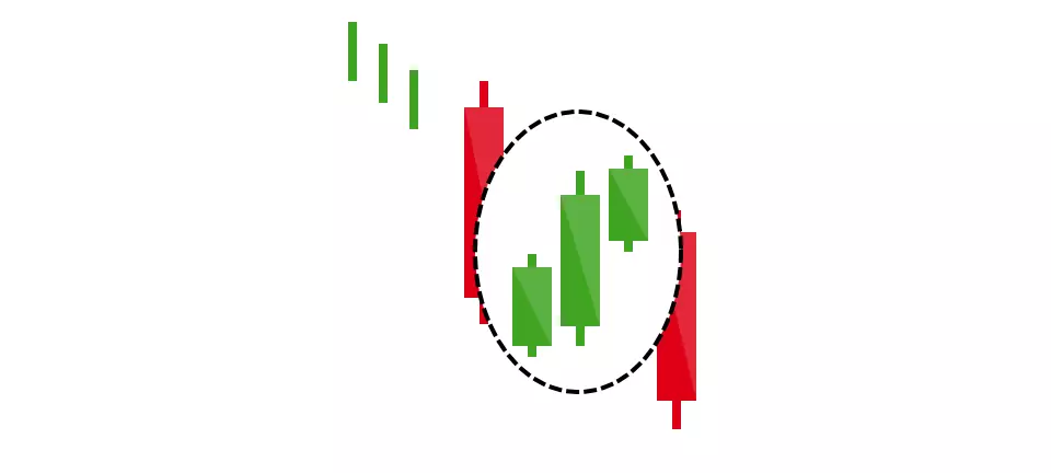
Morning star candlestick
The morning star gets its name from being an optimistic upward sign in a downtrend. It involves three sticks – one short-bodied candle between a long red and a long green. Traditionally, the ‘star’ or middle candle will have no overlap with the longer bodies as the market gaps on the open and the close of the day.
It signals that the selling pressure of the first day is subsiding and a bull market is on the horizon.
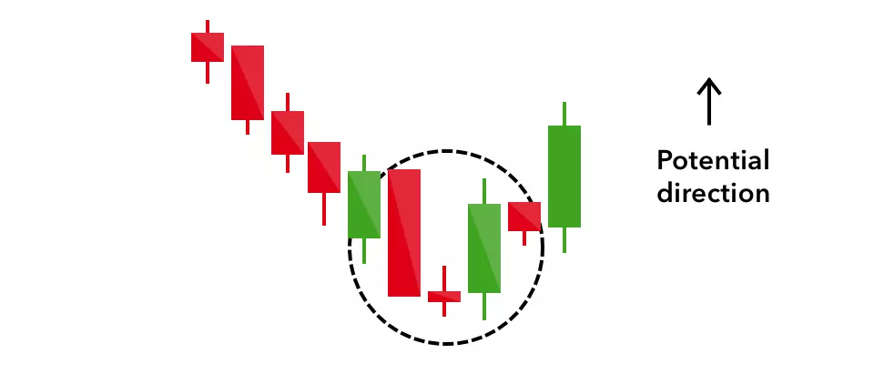
Three white soldiers candlestick
This consists of three consecutive green candles (so, three days) with short wicks that open and close progressively higher than the previous day’s candle. It’s an extremely strong bullish signal occurring after a downtrend, showing a steady advance of buying pressure.

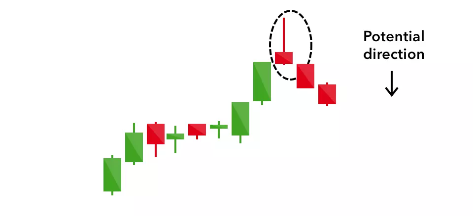
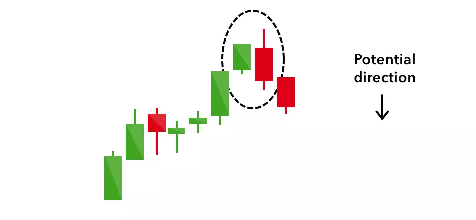
Bearish candlestick patterns
Bearish candlestick patterns indicate a point of resistance following an uptrend. They tend to tell traders that they should potentially close their long positions and sell to take advantage of the falling price.
Hanging man candlestick
This is the bearish equivalent of a hammer candlestick pattern – it has the same shape but forms at the end of an uptrend. There’s, therefore, little-to-no upper wick, but a long lower shadow. It indicates a significant sell-off during the day that was shifted by buyers pushing the price up again. It shows that those in long positions are losing the market.
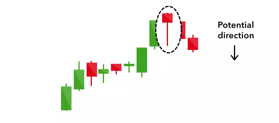
Shooting star candlestick
These take the same shape as an inverted hammer, so they have long upper wicks and small lower wicks, looking like an upside-down hammer. It’s formed in an uptrend and the market will usually gap slightly higher on opening and rally to an intra-day high before closing at a price just above the open – like a falling star.
Bearish engulfing candlestick
A bearish engulfing pattern occurs at the end of an uptrend. The first candle is a small-bodied green stick and is engulfed by a longer red candle. This shows a peak in price, indicating an upcoming bearish market. The lower the second candle reaches, the more significant the downturn might be.
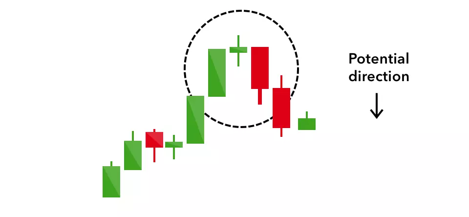
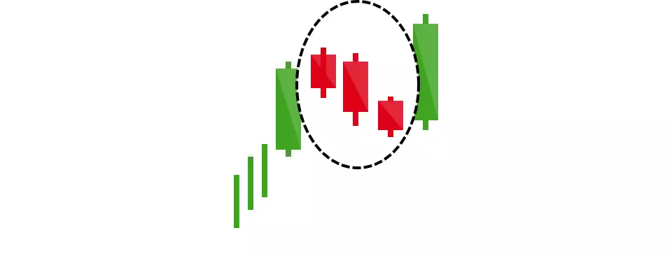
Evening star candlestick
This is a three-stick pattern equivalent to the bullish morning star. A short candle – the ‘star’ – is sandwiched between a long green and a large red stick. It indicates an uptrend reversal and is particularly strong when the third candlestick erases the gains of the first candle.
Three black crows candlestick
The three black crows consists of three consecutive long red candles (so, three days) with short or no wicks. Each session opens at a similar price to the previous day, but selling pressures push the price lower and lower with each close.
Traders see this as an indication of a downtrend, as sellers have overtaken buyers for three days in a row.

Dark cloud cover candlestick
This tells traders that there might be a bearish reversal, a sort of ‘black cloud’ over the bullish day before. It consists of two candlesticks, with a red opening above the previous green body, closing below its mid-point. It indicates that those with a bearish position have pushed the price significantly lower.
Continuation candlestick patterns
Continuation candlestick patterns indicate that there isn’t an obvious upcoming change in the market’s direction. These help traders identify rest periods where there’s indecision or neutral price movement.
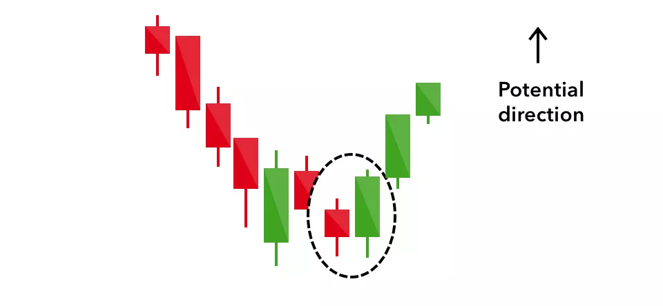
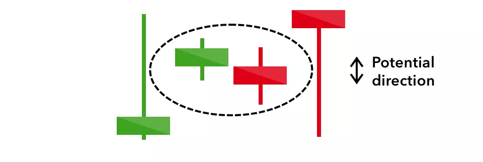
Doji candlestick
These candlesticks resemble a plus sign (they have small bodies compared to their wicks) and appear when the market’s open and close are at similar price points. On its own, the doji signifies neutral movement, but you can find it in reversal patterns such as the bullish morning star and the bearish evening star.
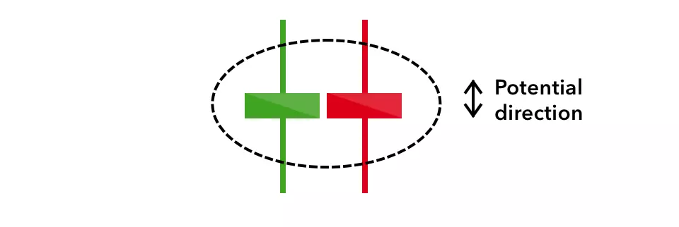
Spinning top candlestick
Much like the shape of a spinning top, this candlestick pattern has a short body centred between wicks of equal lengths. It shows that there’s indecision in the market with no meaningful price change. Essentially, traders with short positions push the market down while those holding long positions push it up.
Generally, it’s a fairly benign sign, but they can be interpreted as a signal that the current market pressure is losing control.
Falling three methods candlestick
Like all three methods candlesticks, this one predicts a continuation of a trend – in this case, downward.
This pattern has a long red body followed by three short green candlesticks, then another red body. It shows traders that bullish positions don’t have enough strength to reverse the trend.
Rising three methods candlestick
This pattern has a long green body followed by three short red candlesticks, then another green body. It tells traders that a reversal of an upward trend is probably not on the cards – the bulls retain control of the market.
How to start trading candlesticks with us
- Create an account or log in
- Identify and interpret candlestick patterns on your market of choice
- Click ‘buy’ to go long or ‘sell’ to short on CFDs
- Set your position size
- Take steps to manage your risk
- Open and monitor your position
IGA, may distribute information/research produced by its respective foreign affiliates within the IG Group of companies pursuant to an arrangement under Regulation 32C of the Financial Advisers Regulations. Where the research is distributed in Singapore to a person who is not an Accredited Investor, Expert Investor or an Institutional Investor, IGA accepts legal responsibility for the contents of the report to such persons only to the extent required by law. Singapore recipients should contact IGA at 6390 5118 for matters arising from, or in connection with the information distributed.
The information/research herein is prepared by IG Asia Pte Ltd (IGA) and its foreign affiliated companies (collectively known as the IG Group) and is intended for general circulation only. It does not take into account the specific investment objectives, financial situation, or particular needs of any particular person. You should take into account your specific investment objectives, financial situation, and particular needs before making a commitment to trade, including seeking advice from an independent financial adviser regarding the suitability of the investment, under a separate engagement, as you deem fit.
Please see important Research Disclaimer.

Explore the markets with our free course
Discover the range of markets you can trade on - and learn how they work - with IG Academy's online course.