Candlestick trading explained
Candlesticks are used in technical analysis and can help traders to accurately predict market movements. They will look at the shape and colour of candlesticks to get a sense of trends and patterns in a given market.
What is a candlestick?
A candlestick shows an asset’s price movement over a set amount of time. This can be anywhere from a minute to a day, depending on the price chart. They display four different price levels which an asset has reached in the specified time period: the lowest point in an asset’s price, the highest point, and the open and close prices.
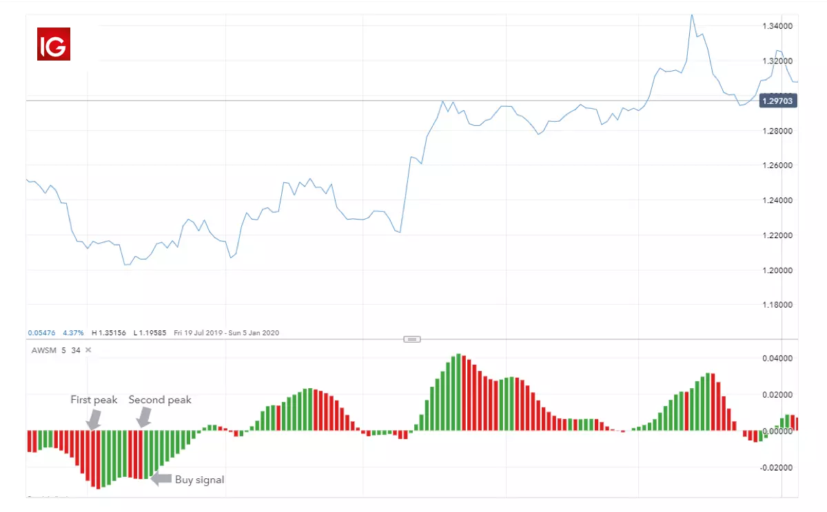
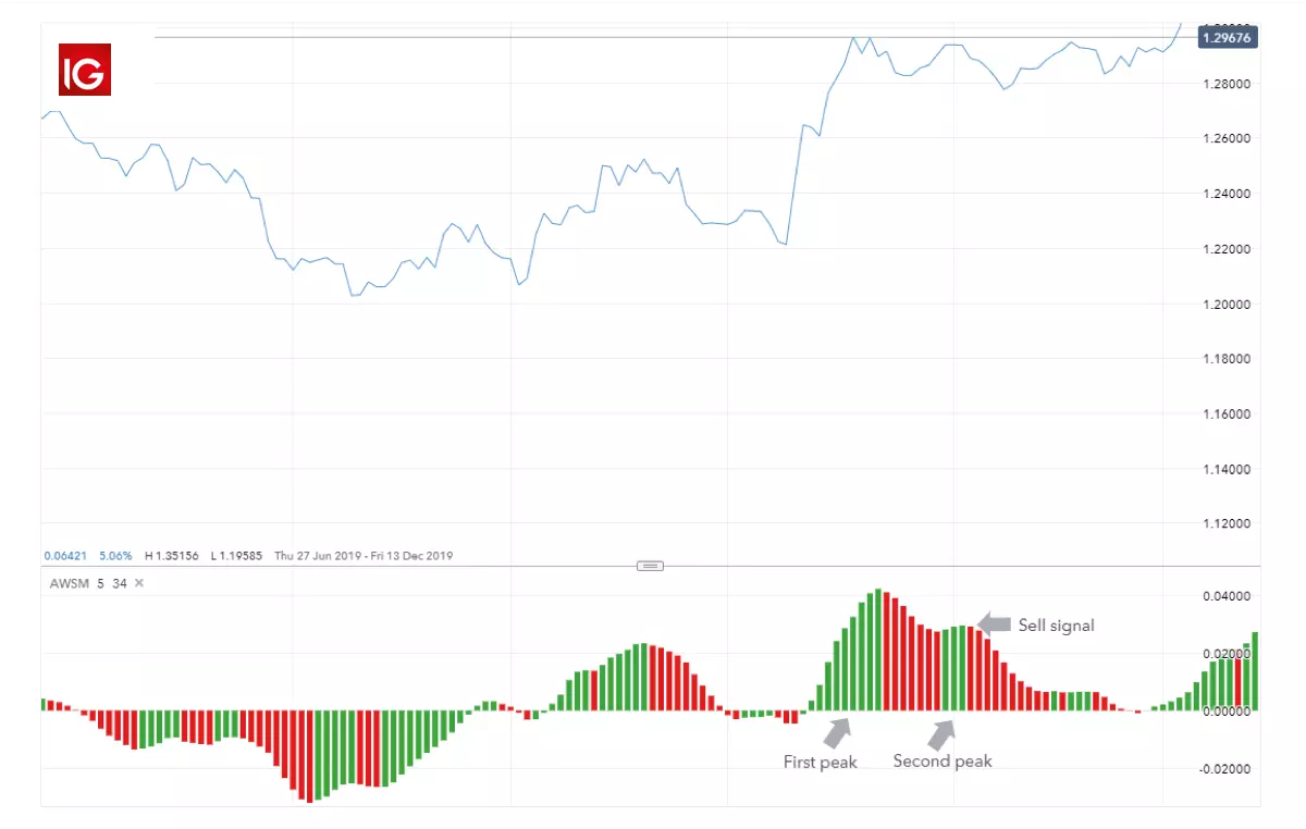
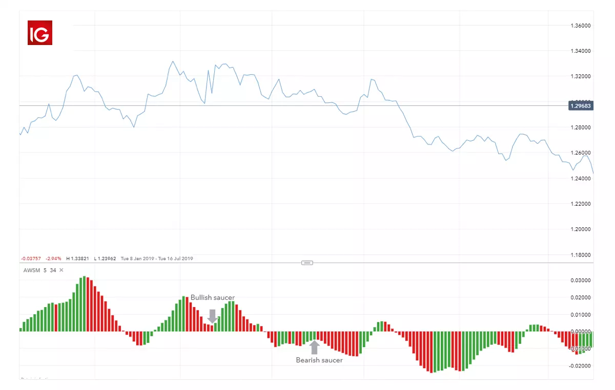
Candlestick patterns are used in all forms of trading, including forex, indices, shares and commodities trading.
How to read candlesticks
You read a candlestick by looking at its colour, body and wicks. Knowing how to read candlestick charts can help you to identify or predict market movements.
Colour of the candlestick
The colour of a candlestick is used to indicate the way in which a market has previously moved or is currently moving. From the above example, you can see that the chart will be green if the close price is higher than the open price, and will be red if the close price is lower than the open price. As such, the colour of a candlestick is a good indicator of whether a market was bullish or bearish during the given period.
When looking at a candlestick chart, the candlestick on the far left will be from the oldest trading period, and the one on the far right will represent the newest or current trading period. The current candlestick can be moving because the current price is used instead of the close price, meaning the candlestick’s colour could shift from green to red or vice versa before the trading period is over.
Sometimes, you may find that the candlesticks on a graph are filled and not filled, rather than being green and red. An unfilled or white candlestick is the same as a green candlestick, and a filled or black candlestick is the same as a red candlestick.
Body of the candlestick
The body of a candlestick is used to show the difference between an asset’s open and close price (or the current price for the candlestick on the far right). If the candlestick is green, then the bottom of the body represents the opening price and the top represents the closing price. If the candlestick is red, then the opposite is true, and the top represents the opening price and the bottom represents the closing price.
Equally, if the body of the candlestick is long then there has been a period of intense buying and selling. If the body of the candlestick is short, then there has been more of a consolidation in the market for that period.
Wick of the candlestick
The wick or ‘shadow’ of the candlestick shows the highest and lowest prices reached by an asset in the given time period. The top wick, also known as the upper shadow, is the highest price. The bottom wick, or lower shadow, is the lowest price.
A candlestick with a long upper wick and short lower wick shows that buyers were very active during a trading period. However, sellers soon forced prices to fall from their highs, causing the markets to close lower than the level which the upper wick reached. The weak closing price created the long upper shadow.
Conversely, a candlestick with a long lower wick and short upper wick shows us that sellers drove prices lower initially, but then buyers bought cheap and caused prices to recover, with the markets finishing strongly as evidenced by the long lower shadow.
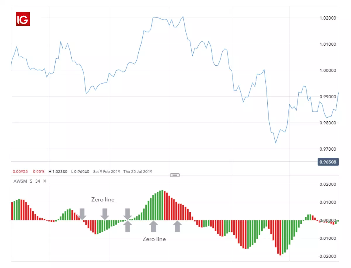
The current candlestick will have dynamic wicks, moving in line with price increases and declines for the given time period.
Types of candlestick patterns
There are many candlestick patterns, which act as useful indicators for traders looking to make price movement predictions.
For instance, one of the bullish candlestick patterns is known as the ‘hammer’ and is formed of a short body with a long lower wick. It is normally found at the end of a downward trend and can be a good indicator of future upward trends.

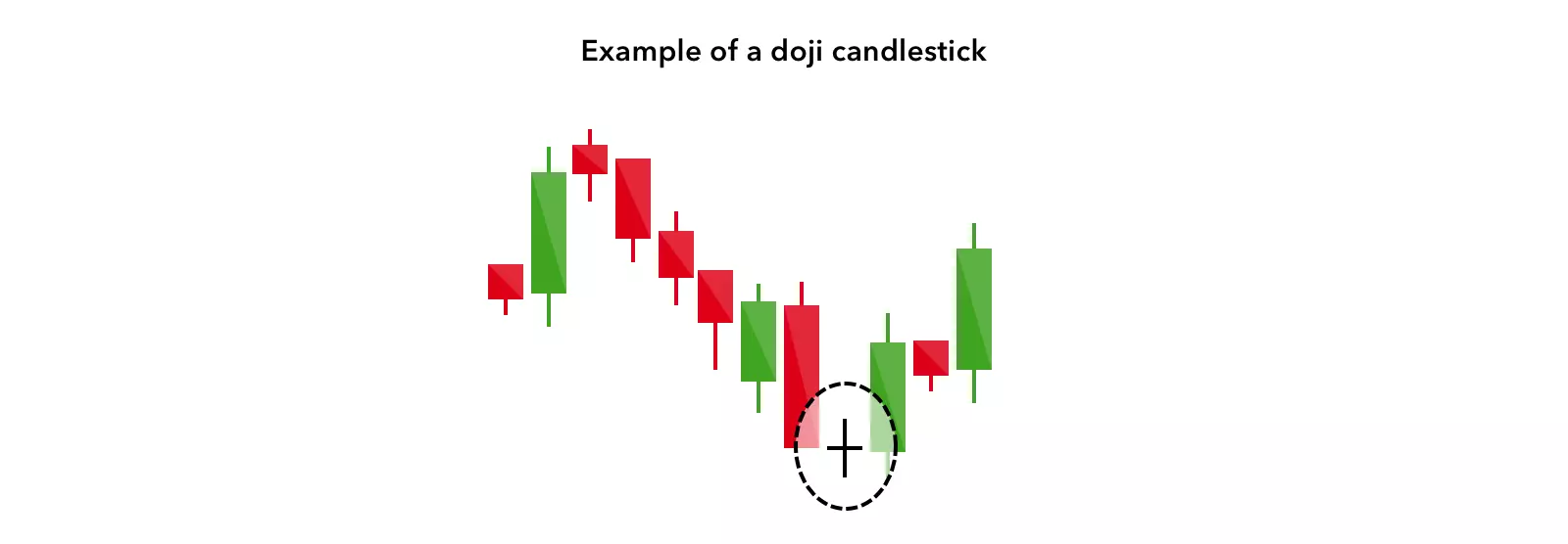
Another candlestick pattern is the doji, which many believe indicates uncertainty from traders in the market. The doji is comprised of a short or non-existent body and wicks of varying length. Sometimes, a doji can resemble a cross, because a doji’s pattern often has similar open and close positions but varying session high and low positions.
Learn more with our guide to 16 candlestick patterns every trader should know.
Candlesticks vs HLOC (OHLC) bar charts
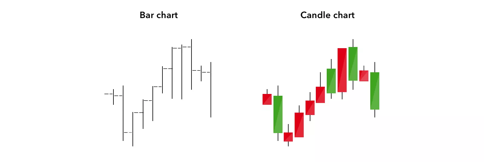
Candlestick graphs are similar to high-low-open-close (HLOC) bar charts. They are both technical analysis indicators, and they both require a certain understanding before traders can use them and learn from them effectively. The main difference is that a HLOC chart lays out the information without the use of the ‘body’ of a candlestick.
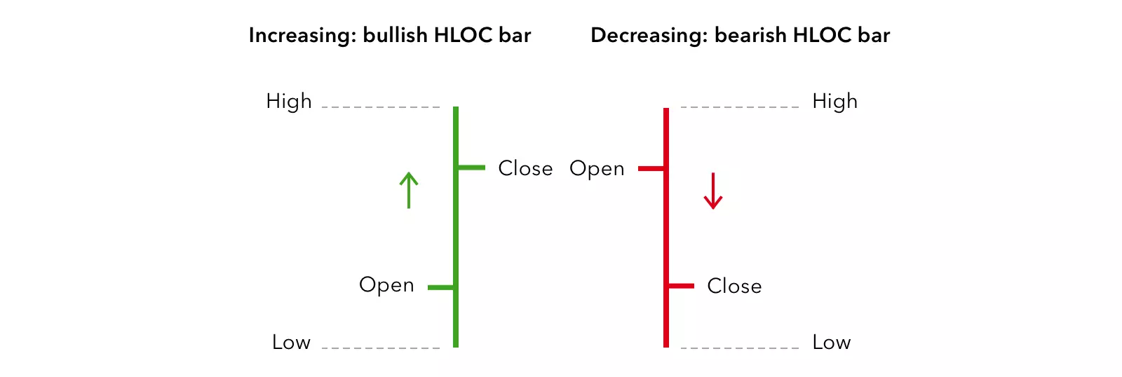
Some traders prefer the simplistic nature of bar charts over candlesticks, while others prefer the aesthetic of candlesticks and say that they offer better clarity. They are both, more or less, the same thing. They both indicate market highs and lows, and the open and close prices for an asset in a particular time frame.
How to use candlesticks when trading
The different parts of a candlestick pattern all tell you something. What they tell you is another question entirely. Sometimes, the shape, colour and direction of a candlestick can seem random, but other times a number of candlesticks may form up to make a pattern.
Candlestick patterns are capable of revealing areas of support and resistance, and are also valuable to traders as a means through which they can confirm their predictions about market movements. However, it is worth mentioning that there is a lot that candlesticks cannot tell you. For instance, you can’t use candlesticks to tell you why the open and close are similar or different.
As such, candlestick patterns should be used in conjunction with other forms of technical and fundamental analysis to greater confirm a trader’s suspicions of an overall trend.
This information has been prepared by IG, a trading name of IG Australia Pty Ltd. In addition to the disclaimer below, the material on this page does not contain a record of our trading prices, or an offer of, or solicitation for, a transaction in any financial instrument. IG accepts no responsibility for any use that may be made of these comments and for any consequences that result. No representation or warranty is given as to the accuracy or completeness of this information. Consequently any person acting on it does so entirely at their own risk. Any research provided does not have regard to the specific investment objectives, financial situation and needs of any specific person who may receive it. It has not been prepared in accordance with legal requirements designed to promote the independence of investment research and as such is considered to be a marketing communication. Although we are not specifically constrained from dealing ahead of our recommendations we do not seek to take advantage of them before they are provided to our clients.

Explore the markets with our free course
Discover the range of markets and learn how they work - with IG Academy's online course.